

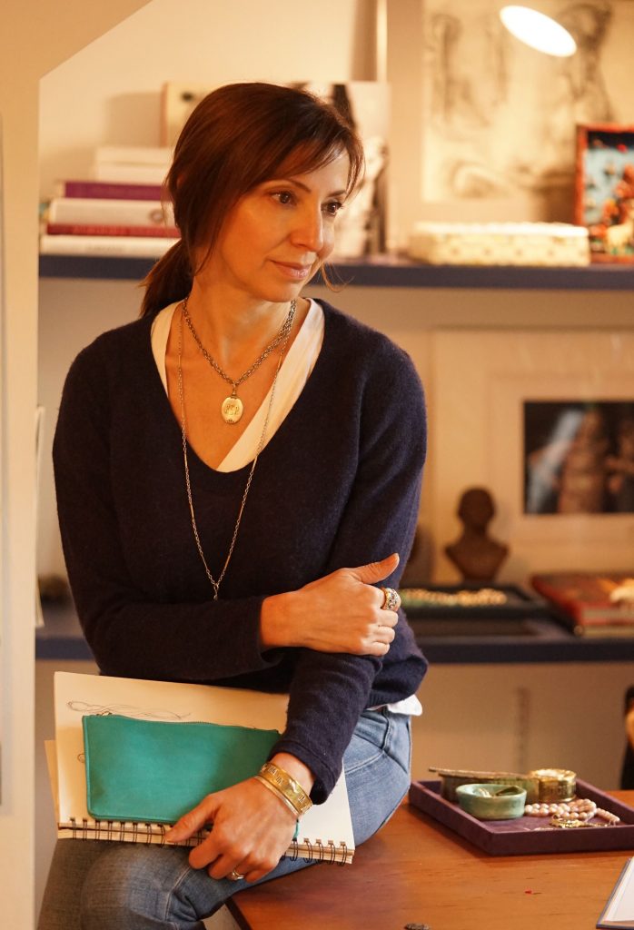
Everything You Need to Know About Signet Rings
 Traditionally, a signet ring
was a symbol of family heritage. Many of the first versions of this ring bore the family crest or coat of arms.
The image was engraved into the ring in reverse so that it could be pressed into hot wax or soft clay and used
to seal a document. The recipient of the document would know that it was authentic because of the symbol in the
wax.
Traditionally, a signet ring
was a symbol of family heritage. Many of the first versions of this ring bore the family crest or coat of arms.
The image was engraved into the ring in reverse so that it could be pressed into hot wax or soft clay and used
to seal a document. The recipient of the document would know that it was authentic because of the symbol in the
wax.Signet rings go by many names, including “seal rings” because of their function to seal letters, as well as a “gentleman’s ring” because it was often worn by the male heirs in the family. In modern times, both men and women wear signet rings.
Modern Signet Rings
In the past, signet rings were only worn by those in the upper class, so they were often associated with elitism. Today, anyone can have a signet ring. Many people still decide to have their family crests engraved into the ring, but this isn’t the only option. It’s also possible to get your initials or any other picture you like included in the ring.
Currently, some rings are worn to symbolize membership in a club. The most common wearers of signet rings include Freemasons or military personnel, who wears rings that symbolize their rank or what branch of the military they are in. As these rings grow in popularity, people are wearing them every day with their outfits or using them as wedding rings.
 How to Recognize a Signet Ring
Despite the fact that signet rings can come in many shapes and sizes and include a crest, initials or other photo, there are some common traits that set these apart from other rings. More often than not, they have a flat bezel and a design is engraved in intaglio, which means that it is raised and can leave an impression if pressed into wax or other soft materials.
While these two traits have to be present to make the ring a signet ring, determining the design, size and shape will be up to your personal preference and style. Some of the most common shapes include the following:
- Oxford Oval – the most traditional and popular shape for signet rings
- Round – a more contemporary and modern option
- Marquise – gives the ring a more sophisticated and elegant shape
- Cushion – this is a square-shaped ring that was popular during the Victorian era

How to Wear a Signet Ring
Traditionally, signet rings were worn on the pinkie finger of a person’s non-dominant hand. This would make it easier to use it for its intended purpose, which was sealing a document. Today, many people still abide by this rule, but not everyone does.
There are no longer any hard and fast rules when it comes to wearing a signet ring, so you are allowed to wear it on the finger that feels most comfortable. As mentioned, some people where them as wedding rings, so they will be found on the ring finger of their left hand. Others wear them on their middle or first finger.
Signet rings are often worn to make a bold statement or show off heritage. They add something unique and special to your style, whether you wear them for special occasions or every day.
By hand, by heart, and always true
A Story of MakingBy Hand
Each Waxing Poetic design begins and ends, quite literally, by hand.
By Hand? Really? Yes.
All our designs start by hand. As in drawn, sketched, outlined, doodled, painted (really, it has happened more than once) or even described with words, written out or otherwise rendered by hand, on the drawing board. Or notebook. Or sometimes sketchbook. Or even possibly a napkin. Or tablet. Or iPad. Whatever it is, we draw it out first. Once we like where a concept is going, we refine the design and send it to our dear friends and artisans in Bali. By Heart
In addition to being one of the most overwhelmingly beautiful places in all the world, Bali is a jewelry designer’s dreamland, home to a tradition of metalsmithing that can be traced back centuries, if not a millenium. Silversmithing is a revered practice and valued trade, and most artisans come from families who have been part of the practice for generations. There is an implicit poetry to the work -- from carving detailed designs into wax to casting pieces to painstaking attention to detail in finishing a design that was apparent to us from our very first collaboration. We are honored to have our designs felt, understood, and translated into being by such beautiful spirits. Balinese silversmiths, or “pandai parak” in Indonesian, are incredibly skilled and internationally regarded as some of the most dextrous, gifted silver artisans in the world. The term “pandai” itself reflects this truth -- it translates as both a noun (metalsmith) and a host of adjectives (clever, skillful, gifted, proficient, resourceful, ingenious and versed, to name a few), and their work itself is proof. Speaking of proof, ‘proof’ is another word for a prototype or sample design. The proof-process feels pretty magical on our end. We send concepts and drawings digitally across the globe and a few weeks later, wonderful little packages containing realized jewelry dreams arrive. What happens in between though is even more magical -- designs literally become jewelry with the help of many sets of hands and hearts.
There’s an old saying that wax, as a material, always tells the truth. It makes sense -- wax impressions catch uncanny details, early sound recording technology relied on wax, and wax document seals were the standard of trust for centuries. Waxing Poetic isn’t just our name, in a way, it describes the very process by which our designs become. Once a Waxing Poetic design arrives in Bali, it soon makes its way to artisan wax carvers, who interpret the 2D rendering into wax with precision tools , translating and our lines and shapes into physical reality. Next, casting artisans take over, a cast gets made, molten Silver poured, cooled, and then the piece is almost ready. Another team of wondrous people refine the next phase of work, adding proprietary treatments which give Waxing Poetic jewelry its particular and recognizable finish, and then, with great care, each new piece is gently wrapped and sent back to California for inspection and approval. Sometimes a proof sample is everything we hoped for in one go, other times we open a package and realize an idea needs to evolve before it makes its entrance as a finished piece of Waxing Poetic jewelry.
 We trust our artisans implicity, and work together in joyous community to realize our creations. It literally takes a village (if not more accurately a few) to make our jewelry, and we hope the hearts and hands who help make it possible resonate with every piece.
International Women's Day
 Waxing Poetic is a company founded by women and inspired by women, and we’re always on board for International Women’s Day, and to celebrate who we are in the balance equation. In our business, it is an absolute honor to employ and and collaborate with women the world over, especially our beautiful Balinese cohorts, with whom we have been working for almost 20 years.Head over to our Story today to meet some of these soul-sisters and heroines who balance motherhood, artistry, and a dedication to their communities. They join us on the daily in bringing Waxing Poetic pieces to life in a way no one else ever could. Everyone benefits from gender balance -- (not just our girls) and we are HERE. FOR. ALL. OF. IT. Celebrating #InternationalWomen’sDay2019 #BalanceforBetter #motherswhobalance #creativeswhobalance #bosseswhobalance #beautyinbalance #lovetobalance #IWD19 #internationalwomensday
 Balance is an ongoing quest. Coffee helps.#waxingpoetic #balanceforbetter
  Balance is independence. #waxingpoetic #balanceforbetter
  Balance is having a safe work environment where her co-workers feel like family. #waxingpoetic #balanceforbetter
  Balance is a steady wage #waxingpoetic #balanceforbetter
  Balance is having the opportunity to help provide for her family. #waxingpoetic #balanceforbetter
  Balance is a beautiful thing. #waxingpoetic #balanceforbetter
Little Goes Far Violet Collection

We’ve been in love with violets for a long time. Their shape, their associated symbolism (memory, devotion, faithfulness, innocence, emotional depth, empathy, and spiritual yearning) , and the fact that they’re probably the most irrefutably feminine of flowers (sorry peonies, we love you too) would be enough to inspire us, but when we read poet and naturalist Diane Ackerman’s book Natural History of the Senses and learned that violets have an almost magical quality that distinguishes them from all other flowers, we got swoony. Simply put -- nature gave violets a unique and memorable gift -- there is a chemical property in violets that causes a delay in human scent perception. When you smell a violet, your brain can’t process it for a few seconds, and so every time you inhale their fragrance, you are actually inhaling a memory.
We hope these little wearable reminders, like the violets which inspired them, go far and long in your hearts and memory.
Save The Elephants
Launching next month: #BeeSaved - a Give-back collection to benefit Save the Elephants
“I traveled to the Masai Mara, Kenya last year, and my time spent observing the elephants, and visiting the fine folks at Save the Elephants in Nairobi, left an indelible mark on me. Their Elephants and Bees project specifically inspired me, and I knew I wanted to try to tell the story of the positive impact of a project like this on the human/elephant conflict crisis.” - Founder Patti Pagliei
Next month, we’ll launch two designs that we hope will bring awareness to the project, and resonate with our customers, conservationists, elephant lovers and advocates beyond. See a sneak peek below.


A rare bird indeed, just like you
 We love to design. We love the unique, the intentional, the rare. Introducing our new Signature Series. Patti dreams up something special, and we hand craft it in a limited quantity, delivering to you something we hope will be treasured and valued. For Keeps. For Joy!Each Limited Edition Signature Series style is inset with poetry, bears our founder’s signature on the back, and is only available for a short time only, or until our supply is gone.
 “We have been fans of the hummingbird for some time, and chose this magical bird as the first in our Signature Series because it is one of the most beloved and enduring representations of a free and beautiful, yet purposeful (read: Poetic) existence. The hummingbird reminds us that the sweetest nectar lies within, and that the journey to discovering this self, this energy and knowing, and healing can and should be made with grace and ease. The dream we dare to have is just this: to be present, alive, and conscious in every moment, like this little bird. To embrace the new beginnings that are the promise of each new day, and to live them fully. ”
Behind The Design: Heartscape - What Matters Most

There is so much coming at us in life, at all times, and sometimes it is hard to stay focused and centered in the truth behind it all. Something that seems like a big deal to us can actually turn out to be quite trivial, and some of the tiny things, the quotidian joys, we may take for granted and dismiss.
What matters, what doesn’t: a life without difficulty may never give someone the opportunity to distinguish between the two. This is what I learned when faced with the greatest challenges of my own life: my own mortality, the sudden illness of my daughter, and perhaps losing this business I created and love so much in the midst of all of this.
So, then, this charm and phrase came into being. WHAT MATTERS MOST. In our humanity, we receive our lessons, we learn from our suffering, and if we want to keep refining ourselves to our highest state of being, we alchemize all so that what doesn’t matter no longer stands in the way of what does matter. And if we can’t alchemize, we let go.
The human experience leads to the divine. We remember who we are and why we are here. What Matters Most, is perhaps, all of this. When I wear this charm, I bring this reminder with me. I have the ice cream. I hug my daughter tight. I breathe. I open myself up to doing what I love, with love, and loving the things that challenge me, bringing me back to what’s really important again and again. This precious life I have been given, the details of which are mine to matter most.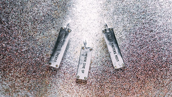

Welcome to Nota Bene (both Latin and Italian for “note well,” which we do around here!). At Waxing Poetic, we make things, and get the chance to see them made real (and loved, and changed – by all of you). Here you will find tiny actions, tiny pieces, and tiny particulars of our process – the small (and not so small) things that matter much.
Enjoy!
Patti Pagliei, Founder


